For this assignment, our goal was to redesign an existing online website that showcased several design challenges. I chose to do Carfax which on the surface seems to do a good job, but when you dig deeper, the small flaws come out and all add up to make one big one.
Carfax is a commercial based website that allows you to browse through new and used cars. Carfax claims that one of the reasons to use their website is because they provide individuals and businesses with the history reports of the cars. The website provides good information; however, it is presented in such a way where the audience would not be able to find a lot of the information, primarily due to its cluttered nature.
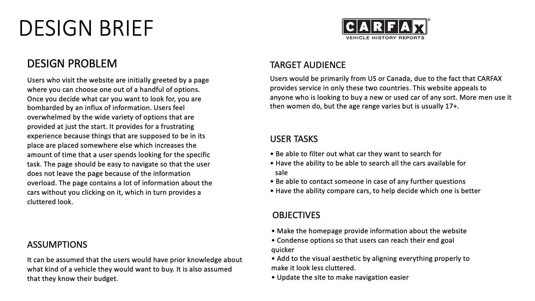
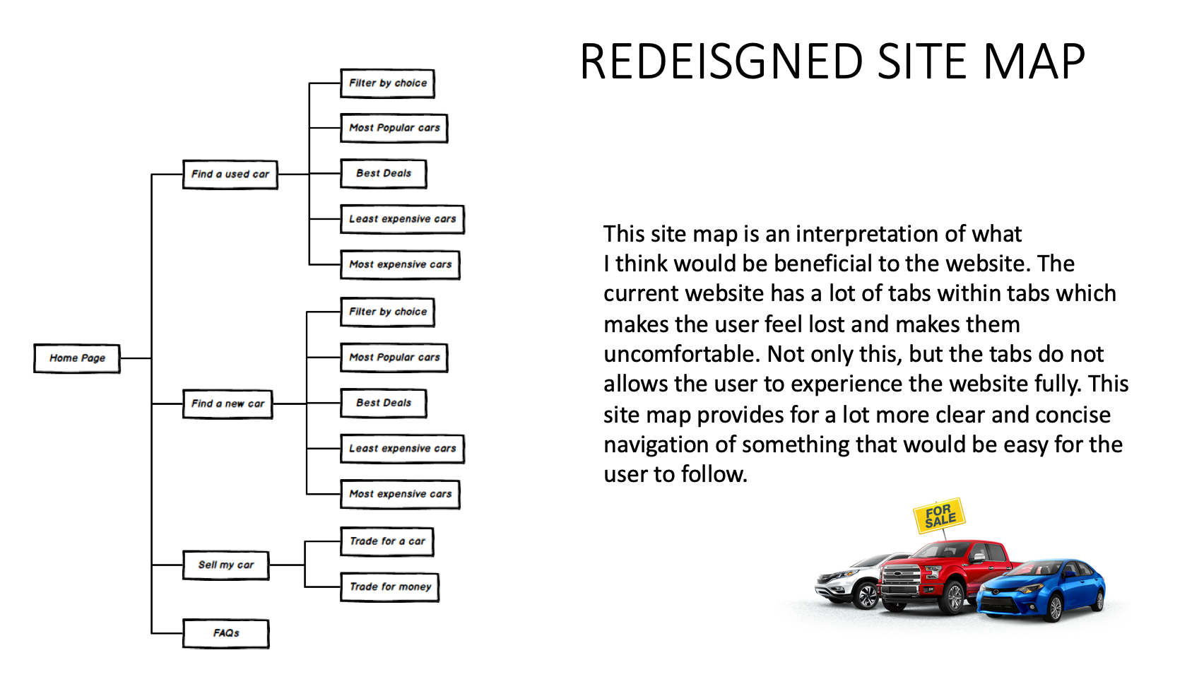
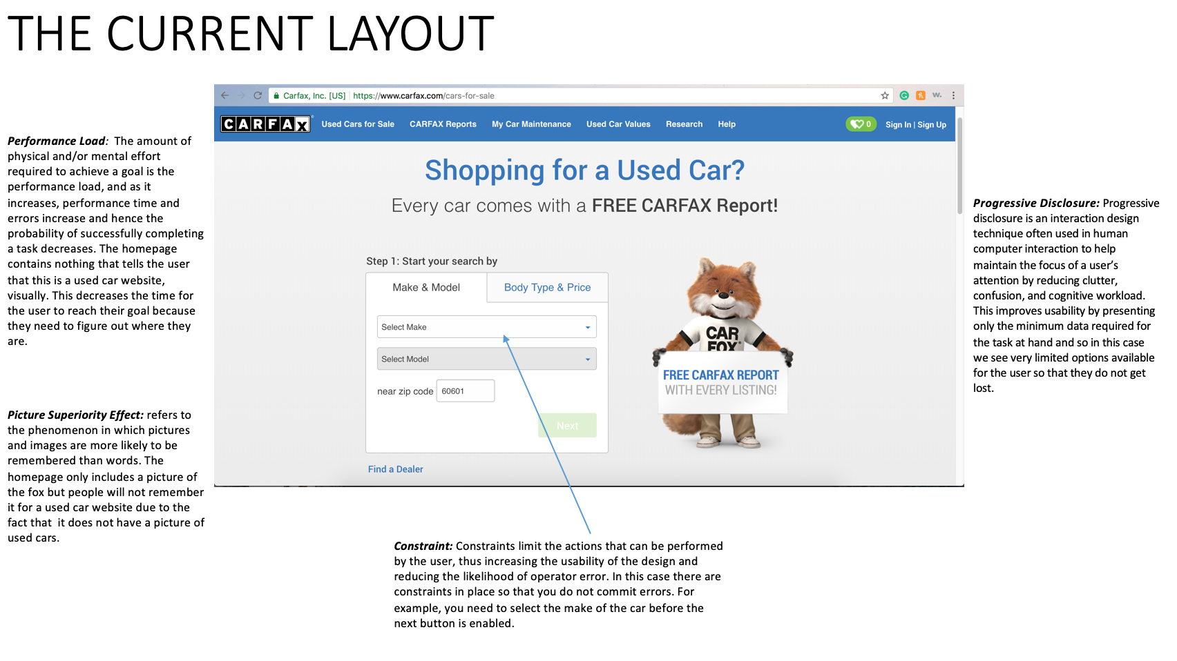
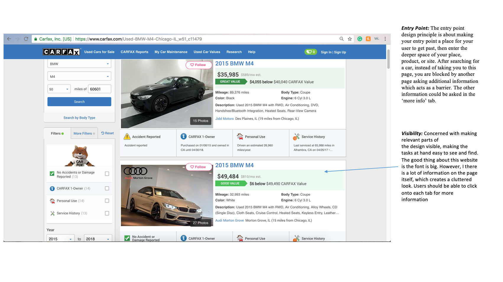
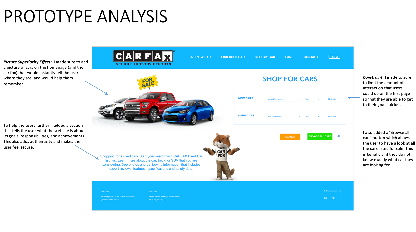
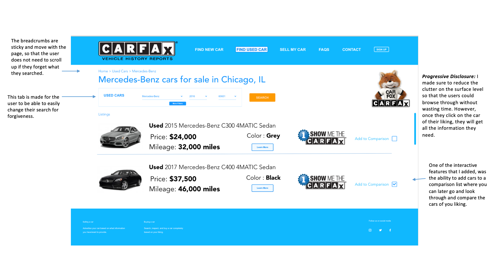
Users that are looking through the Carfax website for knowledge are in fact greeted by a lack of information, and feel underwhelmed by the homepage. It takes the user sometime before they are actually figure out what the website is supposed to due to the lack of information on the page. The page, however, should be easy to navigate so that it is more inviting and allows for the user to reach their goal more efficiently. I changed the pages to make it easy to follow and added breadcrumbs so that the users wouldn’t get lost when they go deeper into the website. I made sure to make the navigation something that the users would be familiar with, and something that would be inviting. I also looked after the homepage and made it more purposeful by adding pictures of cars to show that it is a website about cars.
