* Please note that not all project information is available due to client confidentiality agreements (NDAs). For further details or inquiries about any of the projects mentioned, please do not hesitate to get in touch with me. Thanks for understanding!
In this project, we joined a collaborative journey involving a team of data scientists and product designers. Our overarching goal was to create a custom product capable of accurately predicting consumer demand at scale, all while ensuring the results were actionable and comprehensible. Notably, in light of the project’s complexity, we opted to develop a custom web application, as opposed to utilizing readily available tools like PowerBI or Tableau.
The task at hand was compounded by the constraint of a compressed timeline, spanning just a few months. Within this time frame, we conducted comprehensive research and user interviews, evolving our design from low-fidelity wireframes to sophisticated high-fidelity prototypes. This iterative process was influenced by our data scientist teammates, who provided continuous insights and revisions. Our journey represents the mix of data-driven expertise, and design proficiency with the potential to redefine how we approach consumer demand prediction.
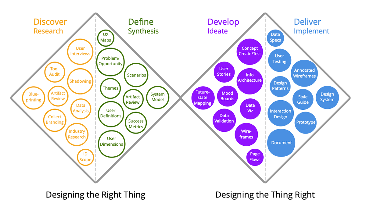
We used the Double Diamond design thinking approach that allowed us in transitioning from developing ideas to delivering a refined solution of 50+ screens.
Team
2 UI/UX Designers
7 Data Scientists
2 Developers
1 Project Manager
Timeline
4 Months to Release
Challenge:
One of the most intriguing challenges I encountered during this project was the collaboration with data scientists. While our team shared a common goal of creating a data-driven solution, bridging the gap between our design expertise and their technical knowledge posed a unique set of hurdles. Understanding the nuances and insights they had acquired over time was key to deciphering a complex puzzle. They had a wealth of information about data collection, analysis, algorithms, and modeling techniques that required a deep dive into their world. As designers, we had to immerse ourselves in their mindset, learning to appreciate the meaning behind the machine learning algorithms, and the impact of variables. This endeavor demanded effective communication, patience, and a willingness to stretch our design boundaries to ensure our final product not only looked appealing but also functioned seamlessly with the data-driven foundation beneath it. In the end, our collaboration expanded our horizons, and created a robust design solution for the problem.
Step 1: Research
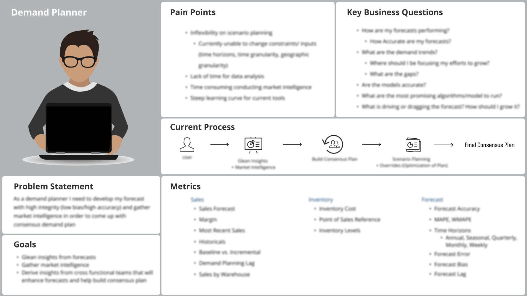
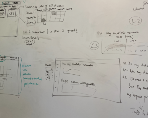
This step marked the crucial starting point in our project design journey, focusing on gaining insights into the challenges data scientists encounter within the current processes. We conducted a thorough user research phase, diving deep into the experiences and pain points of data scientists in their day-to-day work – this was done primarily through numerous user interviews. Through this research, we documented the gaps and shortcomings in their workflow, pinpointing key user groups and highlighting high-level design requirements to address these issues effectively. This foundation allowed us to create vivid user personas that served as accurate representations of our target audience, helping us better understand their unique needs and aspirations. Using this invaluable knowledge base, we proceeded to design wireframe sketches that laid the groundwork for a solution.
Step 2: Synthesis
In Step 2 of our project phase, we focused on the crucial task of synthesizing the findings obtained in the previous step. This involved an approach to organizing and distilling the amount of insights we had gathered. To accomplish this, we mapped and documented the existing workflows, creating a visual representation that illuminated the details and pain points within the current processes. We crafted an overarching information architecture that provided a structured framework and mapped out the entire workflow, perfect for synthesizing our discovery findings. This step was pivotal in enabling us to chart a strategic course for both the short and long term. By mapping our research into a coherent picture, we not only gained an understanding of the challenges and opportunities but also paved the way for a well-informed and effective design solution that catered to the specific needs of our project.

IA blurred for confidentiality, but intended to convey a sense of page layout, and design elements.
Step 3: Ideate
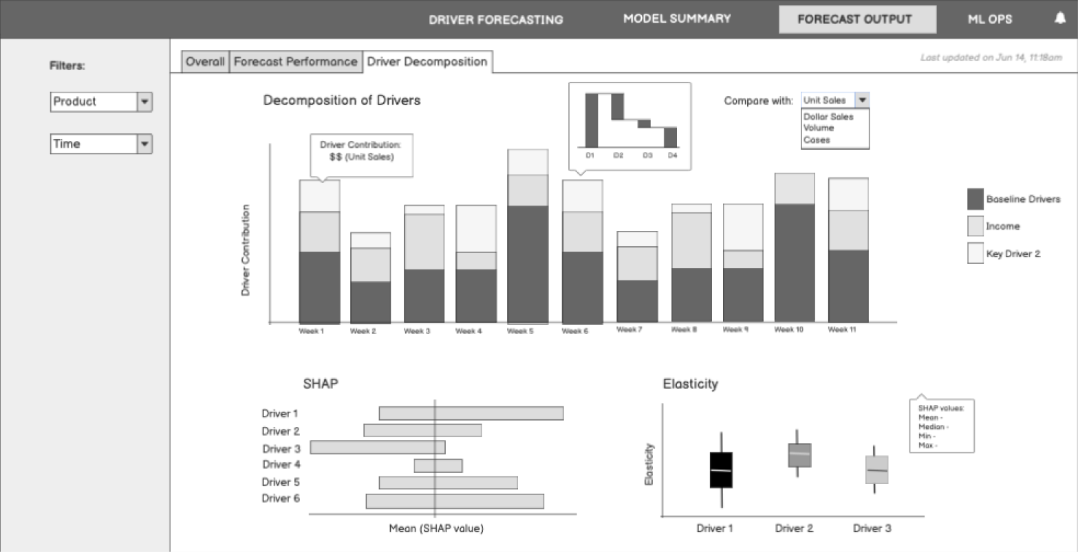
Step 3 in the project was the ideation phase, a critical and creative stage where innovative solutions are generated to address the project’s objectives and challenges. In this phase, the focus was on developing and executing ideas following an agile process to create low-fidelity wireframes through multiple rounds of iterations and refinements. Let’s break down this process in more detail:
1. Ideation:
Creative Ideation: Ideation is the heart of this phase. It involves brainstorming and idea generation. The team collaboratively explores various concepts and approaches to tackle the design problem. The emphasis is on generating a multitude of ideas without judgment.
2. Agile Methodology:
Flexibility and Iteration: We adopted an agile approach in the ideation phase that allowed for flexibility and responsiveness to changing requirements or insights. It meant we did not need to have all the answers upfront. Instead, we started with a basic concept and iterated as we learned more.
3. Low-Fidelity Wireframes:
Visual Prototyping: Low-fidelity wireframes are rudimentary sketches or diagrams that outline the structure and layout of the design. They are intentionally simplistic, focusing on the arrangement of elements and basic interactions rather than fine details.
4. Multiple Rounds of Iterations:
Iterative Design: The ideation phase is iterative by nature. We created an initial set of low-fidelity wireframes, then refined and improved them through multiple rounds of feedback and iteration.
User-Centered Focus: Iterations incorporated feedback from user testing, stakeholder input, and the team’s insights. This iterative process ensures that the design aligns with user needs and project objectives.
5. Collaboration:
Cross-Functional Teams: Collaboration is crucial during ideation. Designers, developers, product managers, and other relevant stakeholders worked closely together to refine the ideas and wireframes.
In conclusion, the ideation phase in the project was a dynamic and creative journey. By following an agile process, developing low-fidelity wireframes, and iterating through multiple rounds of refinement, we gradually shaped our design concepts into well-informed and user-centric solutions.
Step 4: Implement
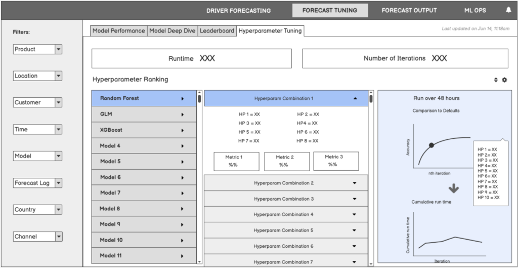
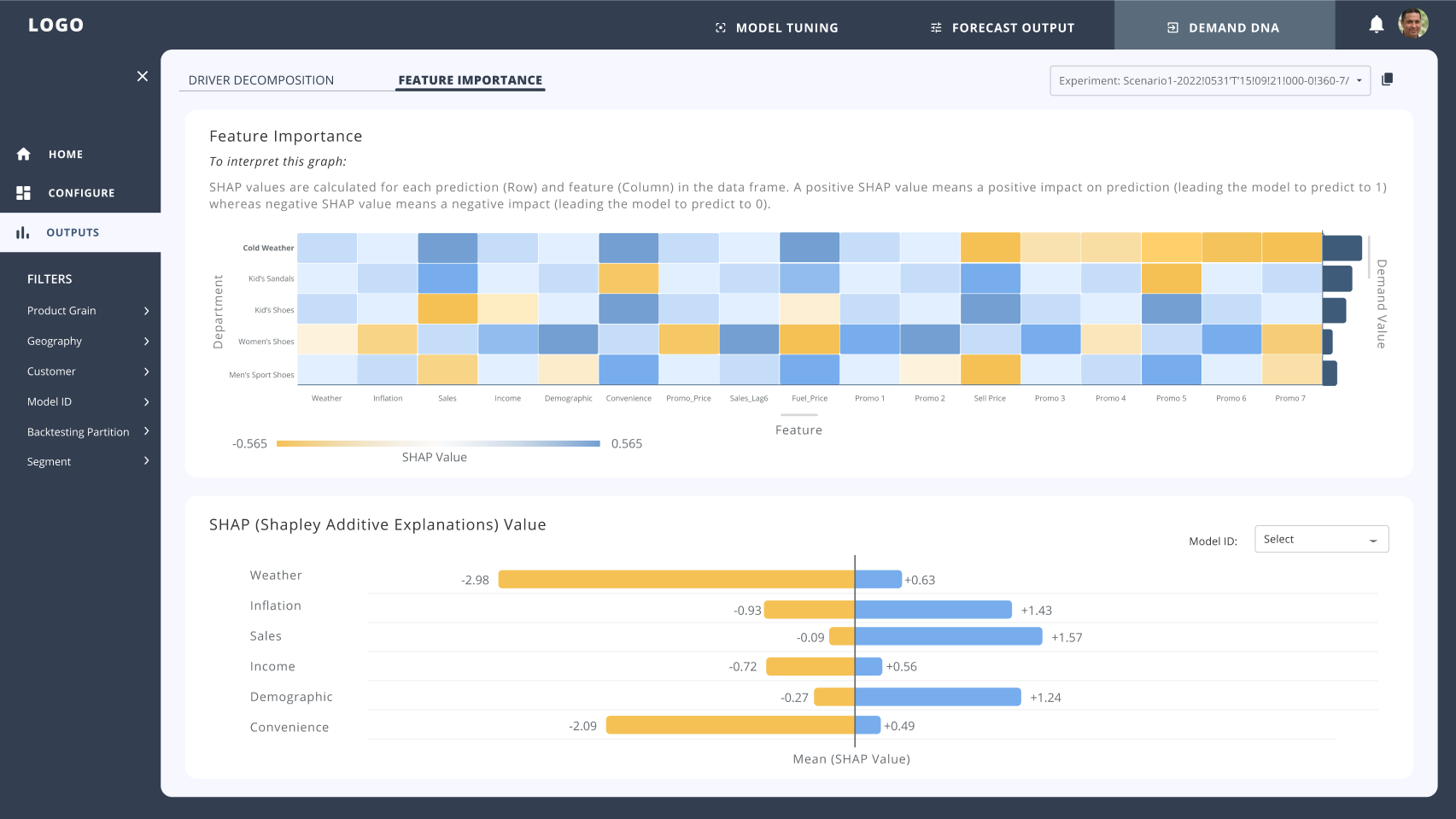
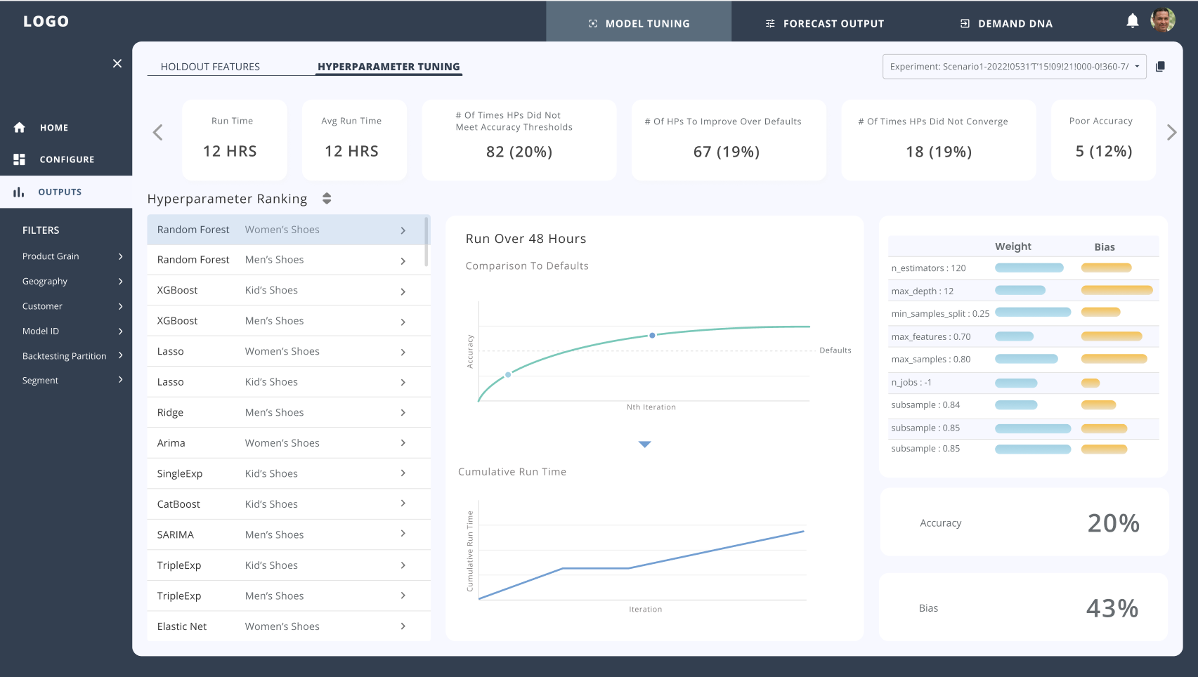
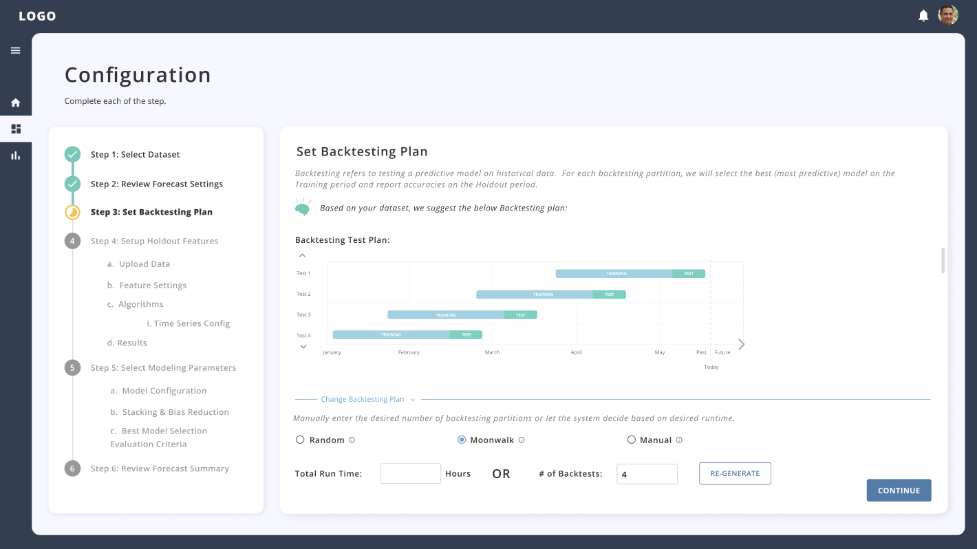
Step 4 was a pivotal stage where we transitioned from low-fidelity concepts to high-fidelity wireframes through constant iteration and refinement of the visual design. This phase was crucial in bridging the gap between our initial ideas and a more polished, detailed, and user-ready design. Here’s how it unfolded:
Converting to High-Fidelity:
We started by shifting our focus towards creating high-fidelity wireframes. These wireframes represented a more detailed and refined version of our initial concepts. They incorporated specific colors, typography, imagery, and interactions to closely resemble the final product’s appearance and functionality.
Constant Iteration:
Iteration remained a constant theme as we progressed. High-fidelity wireframes were far from static; they evolved through continuous refinement. This iterative process ensured that our design stayed in sync with the evolving project goals and user needs.
Refining Visual Design:
We paid meticulous attention to refining the visual design. Achieving visual consistency was a top priority. We worked to harmonize design elements such as fonts, colors, icons, and imagery to create a cohesive and aesthetically pleasing user interface.
Testing with End Users and Stakeholders:
Before finalizing the design, we conducted usability testing with end users. This step allowed us to gather invaluable feedback on the usability, functionality, and overall user experience of the high-fidelity wireframes. We also engaged with key stakeholders to ensure alignment with project goals, business objectives, and brand guidelines, addressing any business-specific requirements.
Handoff to Developers:
Once the high-fidelity wireframes were in a good place and had received validation from both users and stakeholders, we prepared them for handoff to the development team. This involved clear communication and ongoing collaboration between designers and developers.
In retrospect, this last step of the project marked a significant milestone. It was the stage where our ideas started taking a concrete form, and the design began to shine. Through refinement, testing, and collaboration, we were able to create a user-centric and visually appealing interface. This set the stage for the implementation phase, bringing us one step closer to providing a solution for the problem.
Here is a look into some of the high fidelity wireframes that were sent out for development production:
What’s Next?
Looking ahead in our project journey, the meticulously crafted designs will transition into the hands of the development team. From there we will move towards the launch of our Minimum Viable Product (MVP). However, our journey does not end there. Once the MVP is deployed, our mission will continue as we remain dedicated to refining the application based on user feedback and addressing any unforeseen bugs or issues. This iterative approach will lay the foundation for the future, as we look forward to Version 2.0, which will be even more impactful and user-centric.
