* Please note that not all project information is available due to client confidentiality agreements (NDAs). For further details or inquiries about any of the projects mentioned, please do not hesitate to get in touch with me. Thanks for understanding!
 
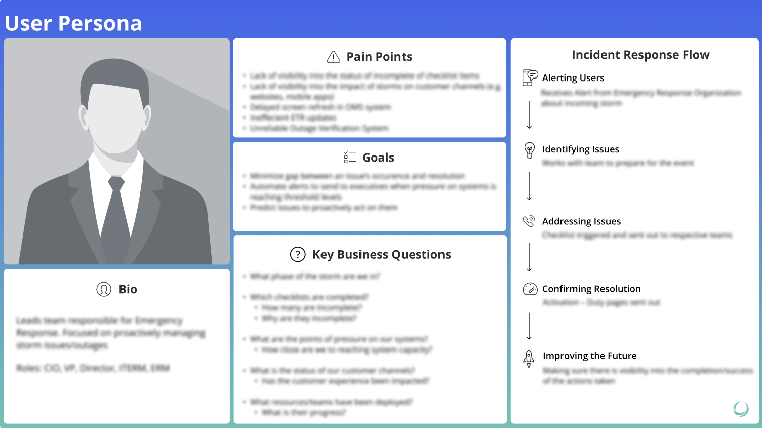
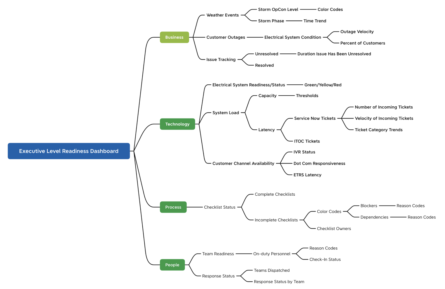
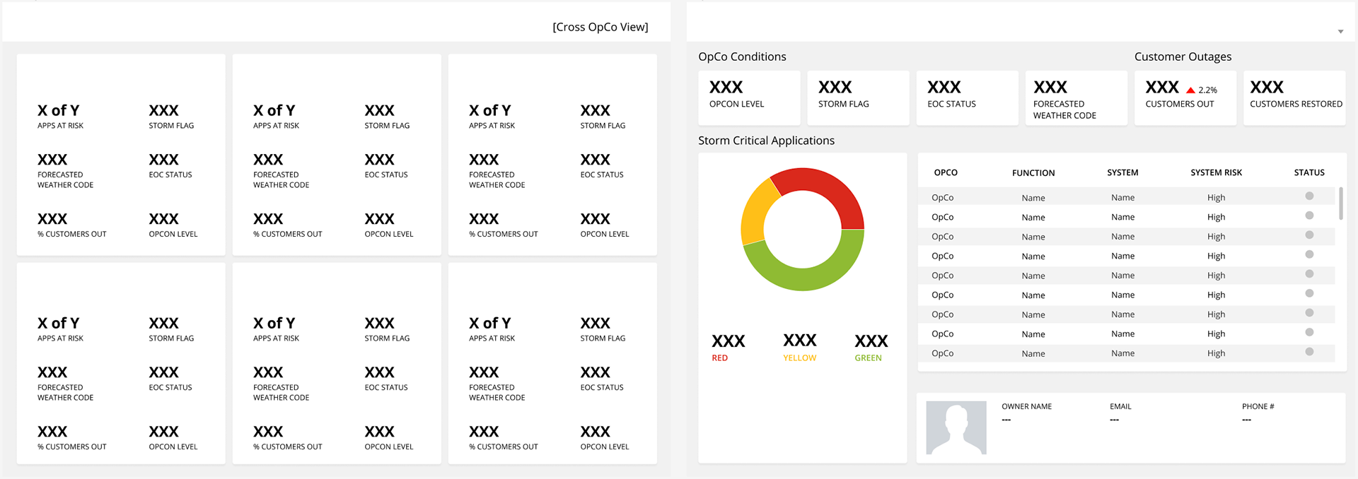
In a world where weather conditions and the seamless functioning of critical applications can profoundly impact business operations, our team embarked on a transformative design journey tasked by our clients. Our challenge was to create a dashboard on Tableau that would empower executives with real-time insights, enabling them to monitor not just the weather but also the status of their most vital applications. We embraced a novel approach: the control tower concept. This approach provided stakeholders with the ability to continually track the signals of their specific business operations, from the surface symptoms to the underlying root causes, all in real-time. Following, you’ll get a view into the details of our innovative solution, where data, technology, and design converge to revolutionize how executives gain control and clarity in ever-changing conditions and challenges.
 
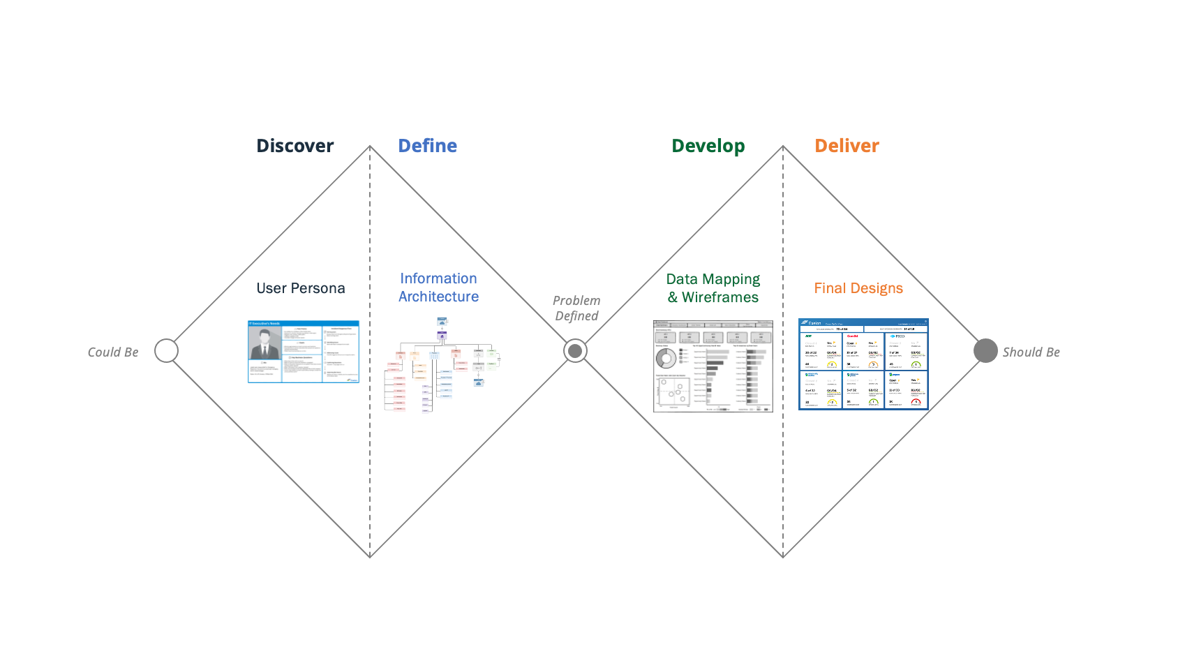
Our design thinking for this project followed the ‘double diamond’ approach which followed the process of understanding user needs in the context of technical constraints and business objectives over 4 over-arching steps: (1) Discover, (2) Define, (3) Develop, (4) Deliver 
 

Team
2 UI/UX Designer  Designers
1 Project Manager
3 Developers 
1 Scrum Master

Timeline
5 Months to Release

Step 1: Discover
 
In the first step of our design discovery phase, we identified key business questions and information needs by creating a user persona. We started by conducting thorough research and engaging with stakeholders to pinpoint the critical questions that drove our project. With this insight, we crafted a detailed user persona that represented our target audience’s role, challenges, goals, and behaviors. This persona became our guiding compass, ensuring that our design efforts would be closely aligned with the end-users’ needs and priorities. This user-centric approach in Step 1 laid the foundation for a strong design process.

Step 2: Define
 
In Step 2 of our project, known as the defining phase, we undertook the task of crafting a structured and intuitive information architecture. This phase revolved around understanding the specific needs and priorities of our stakeholders and translating them into a clear and organized hierarchy of information.
 
Our approach was detailed, beginning with comprehensive discussions with stakeholders to gain deep insights into their requirements. We dived into their objectives, preferences, and the way they interacted with data.
 
Building on this knowledge, we then designed the information architecture, ensuring that it reflected the hierarchy and organization of information that best served our stakeholders’ needs. This architectural blueprint defined the pathways for efficient navigation and retrieval.
 
By the end of Step 2, we had created this well-defined information architecture that ensured that the design and development phases would be streamlined and focused on delivering a user-friendly experience.

Step 3: Develop
 
In Step 3, our discovery phase involved two key aspects. First, we diligently located and gathered the required information from various departments across the organization, establishing clear pathways for data integration into the dashboard. Simultaneously, we designed low-fidelity wireframes to outline the dashboard’s layout and functionality, providing an early visual representation for stakeholder feedback and validation. This simultaneous effort laid a strong foundation for the dashboard project, ensuring data availability and offering an initial glimpse into the dashboard’s design and functionality, facilitating informed decision-making and iterations as we progressed.

Step 4: Deliver
 
In Step 4, we transitioned to the practical implementation of our project. We designed and developed the dashboard using Tableau, with a focus on ensuring an optimal user experience. Our approach involved iterative reviews and collaboration with both business and IT stakeholders, allowing us to refine the dashboard’s design and functionality.
 
After launching the dashboard, we didn’t stop there. Quality assurance (QA) played a vital role in this phase to ensure the dashboard’s reliability and performance. Our QA efforts were directed at identifying and addressing any bugs or gaps that might have surfaced during the initial rollout. This meticulous attention to detail post-launch ensured that the dashboard operated smoothly and met the highest standards of quality and user satisfaction. Step 4 marked the successful culmination of our project, where we delivered a Tableau-based dashboard that not only met stakeholder expectations but also underwent thorough QA to guarantee its perfection in both design and functionality.
What’s Next?
 

In the next phase of our project, we’re committed to maintaining the current dashboard’s performance and user satisfaction. We’ll conduct ongoing Quality Assurance (QA) to address any bugs and user-reported issues promptly.

Simultaneously, we’re gearing up for Version 2.0 of the dashboard. We’ll diligently backlog all user feedback and proposed changes to inform our future developments. This continuous feedback loop ensures that we evolve the dashboard to meet our users’ changing needs effectively. Our journey of improvement continues, driven by collaboration and innovation.