My challenge was to develop a concept for a web site or mobile application that involves the creation or modification of some kind of object. Types of systems involved supporting illustration, coding, photo/video editing, diagramming, building media artifacts, or writing. Systems like emphasize user control and flexibility.
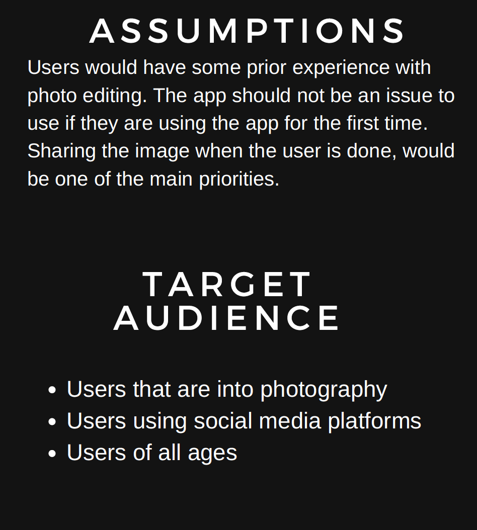
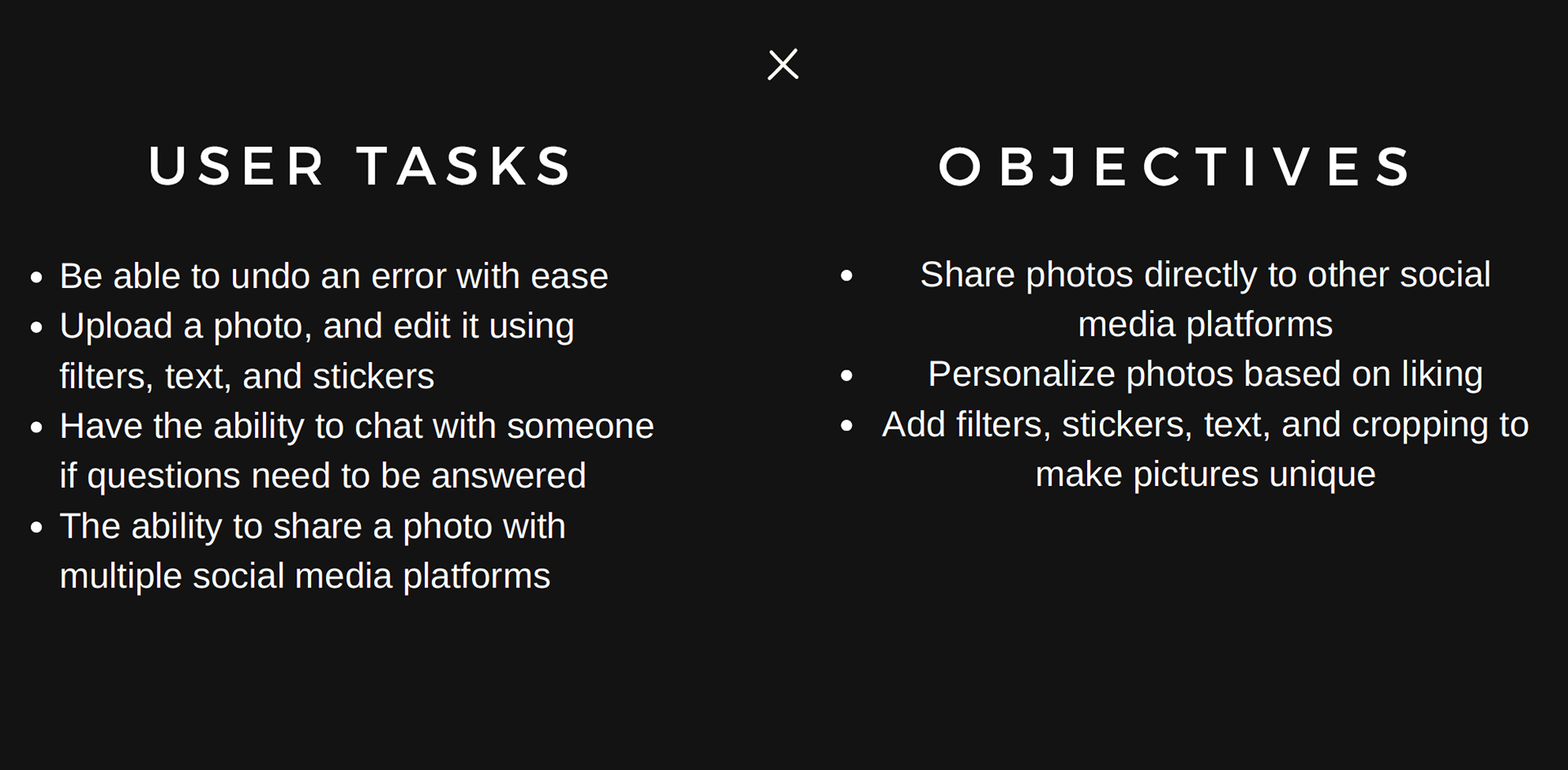
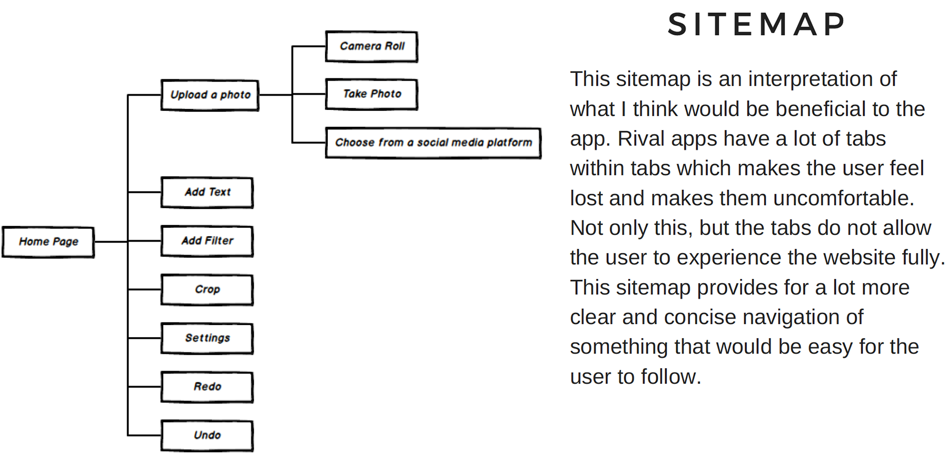
FAUXTO is a photo editing app that aims to provide a premium experience with a minimalistic approach. Users will be able to upload an image from their mobile, computer, the web, or from the FAUXTO gallery. They are then provided with several options that they are able to choose from. I designed this app to be minimalistic and easy to follow, through iconic representation, flexibility-usability trade-off, and good use of mapping. It is important for the user to be familiar with the tools of the app before even using it to ensure comfort. Providing too many options might come across as information overload and could be overwhelming for the user which is why the options need to be constrained to an extent.


I started this project with the aim to design an app that created a welcoming environment and was attractive to users, yet was able to get the job done. I made sure for there to be form and function. I made sure the users would not be overwhelmed when they first get on the screen, therefore, I opted to provide minimal options. I made sure to take advantage of several design principles to help increase the user-friendliness. I chose to provide for a strong design visually, but made sure the interactivity and functionality was stronger.
