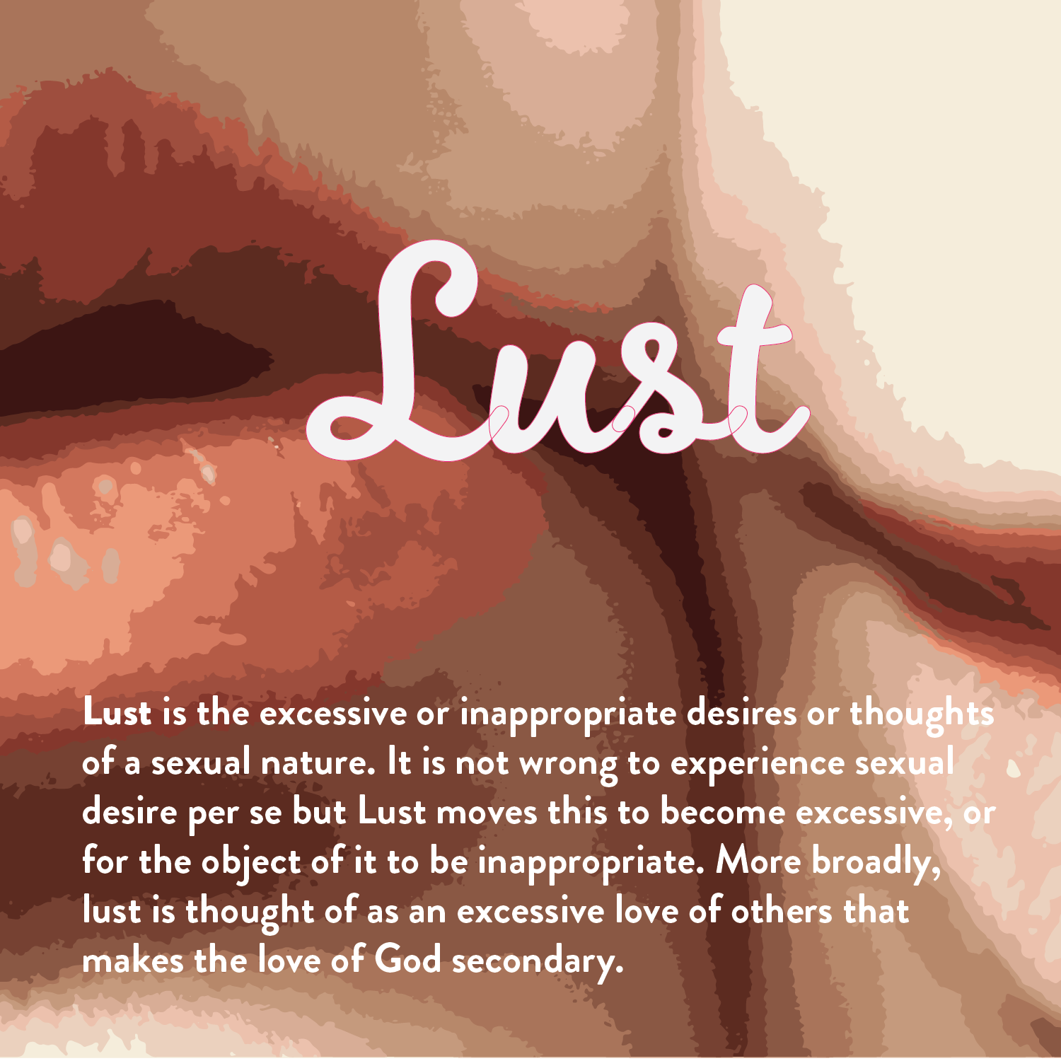
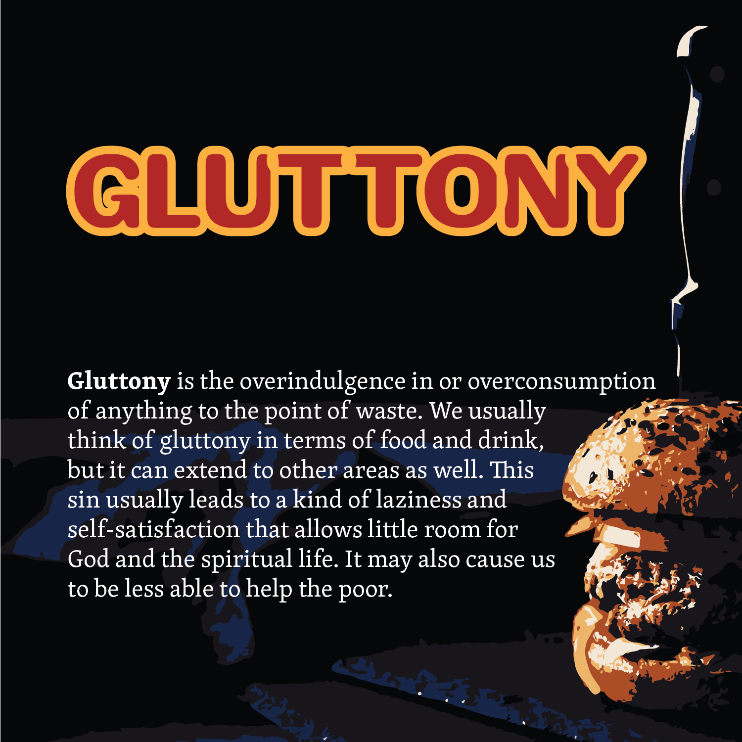
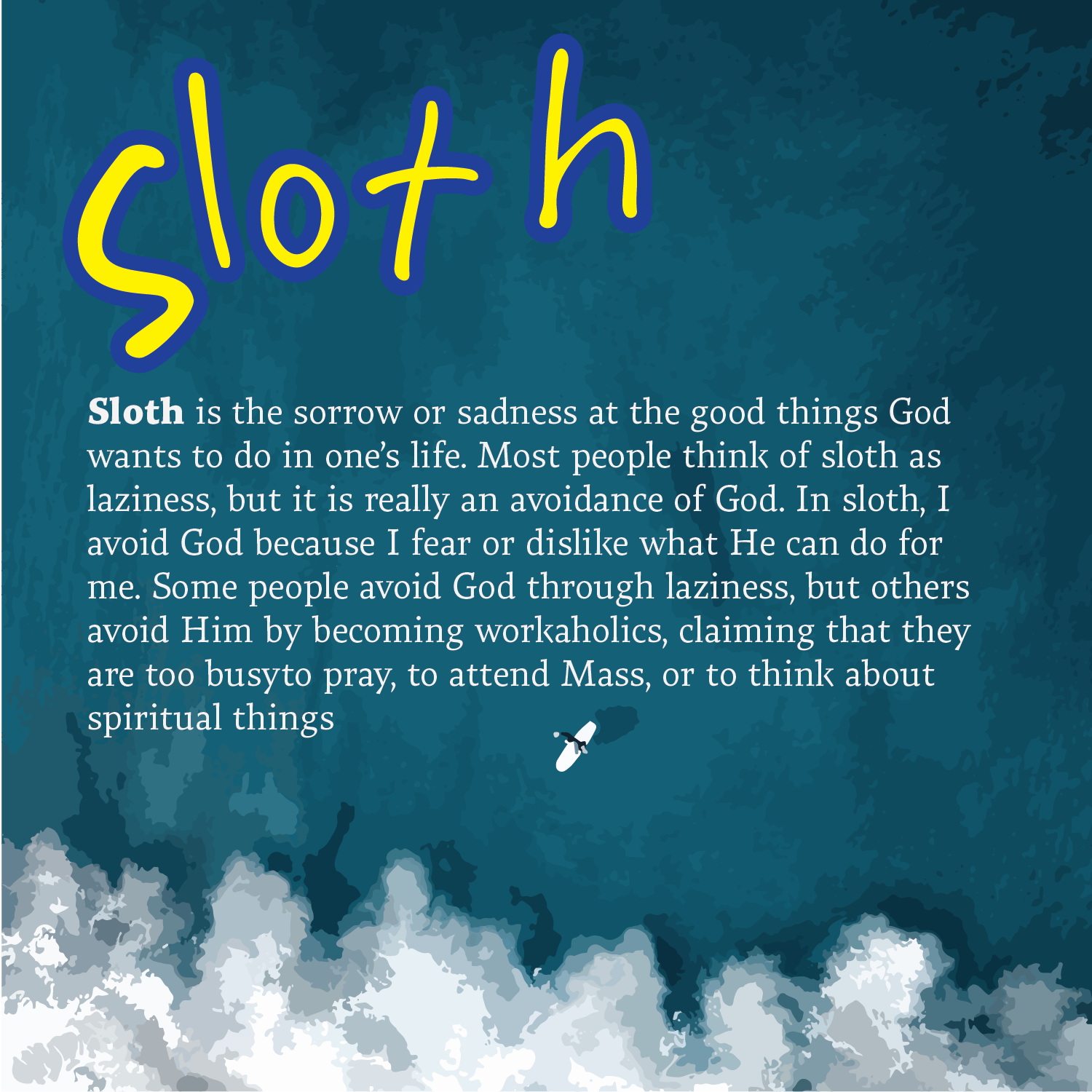
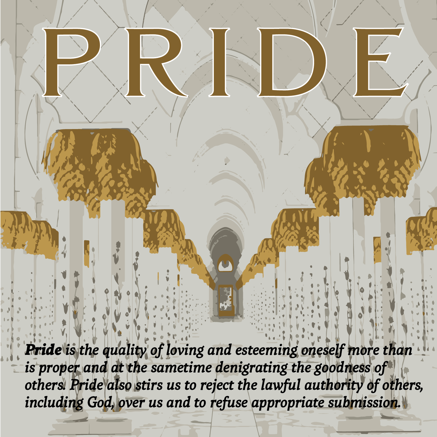
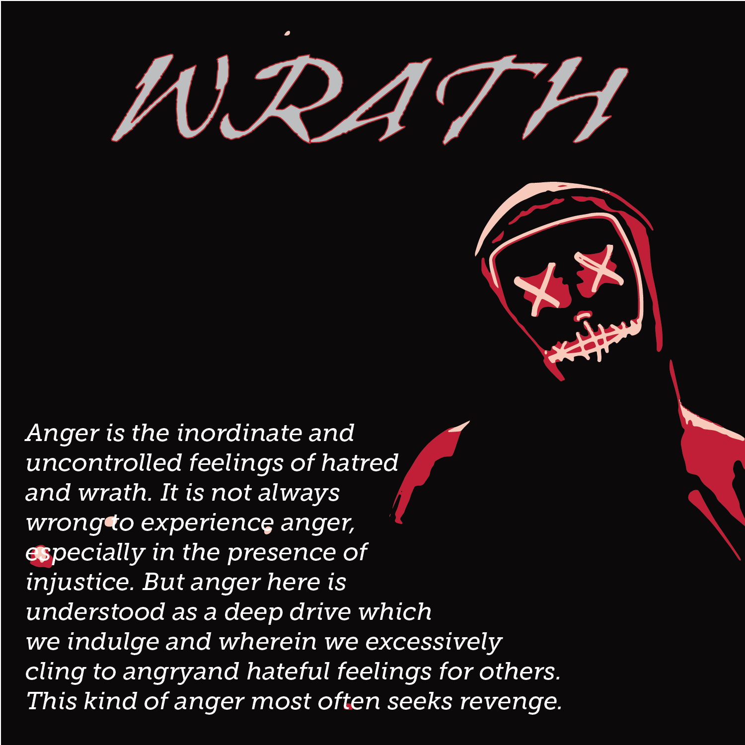
Our assignment was to explore headline typefaces for each of the Seven Deadly Sins. Our goal was to find typefaces that best exemplify each sin. Which typeface feels gluttonous? What characteristics give them a lustful appearance? Once we settled on our typefaces, our job was to kern them properly. Enlarge it. Flip it. Turn it upside down. We did whatever was was necessary to create the most balanced overall letter spacing for each word.
We then had to tell the story of the Seven Deadly Sins through a combination of typographic and photographic layouts. We were tasked with designing a 5” x 5” card for each sin complete with a headline and the small paragraph for each. Our background had to be something photographic that further conveyed the message of each.
